Documentation Index
Fetch the complete documentation index at: https://domoinc-arun-raj-connectors-domo-479583-raisers-edge-connec.mintlify.app/llms.txt
Use this file to discover all available pages before exploring further.
Intro
A latitude-longitude route map is a latitude-longitude map in which coordinate points are connected using lines. Two value columns are required. The values in one of these columns is applied to the start points of all given connection lines, and the values in the other are applied to the end points. In the map, differences in the values of start and end points are represented by the thickness of the lines. For example, if a line started out small at the start point of a line and became bigger, this would indicate that the value became larger. If the opposite scenario were true, this would indicate that the value shrank. If the start and end points were the same, the line would have the same thickness throughout. In other respects, a latitude-longitude route map is the same as a latitude-longitude map. The provided coordinates and applied filters determine the “zoom” level of the map. For more information about filters, see Adding Filters to Your Chart. You can also have multiple distinct routes by uploading an optional series column. For information about world maps, see U.S. County Map. For information about troubleshooting when an area in your map does not show data but there is data, see Troubleshooting.Understanding latitude-longitude route maps
Latitude-longitude route maps require seven data columns or rows from your DataSet, and you can add an optional eighth column for series data if you want. The required columns or rows are as follows:- A column or row containing the names of each route line (for example, “Denver-Omaha”).
- A column or row containing the source latitude for each route line (that is, the latitude for the starting point in a route line).
- A column or row containing the source longitude for each route line.
- A column or row containing the destination latitude for each route line.
- A column or row containing the destination longitude for each route line.
- A column or row containing the values for each route line’s starting point.
- A column or row containing the values for each route line’s ending point.
Powering latitude-longitude route maps
In the Analyzer, you choose the columns containing the data for your map. For more information about choosing data columns, see Applying DataSet Columns to Your Chart. For more information about formatting charts in the Analyzer, see KPI Card Building Part 2: The Analyzer.Example
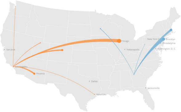
The following graphic shows you how data from a typical column-based spreadsheet is converted into a latitude-longitude route map:
Formats for latitudes and longitudes
Domo recognizes latitudes and longitudes written in any of the following formats:Format Name | Description | Examples |
|---|---|---|
Signed degrees | Uses the format ” |
|
Degrees minutes seconds | Uses the format ” |
|
Degrees minutes | Uses the format ” |
|
Degrees only | Uses the format ” |
|
Customizing latitude-longitude route maps
You can customize the appearance of a latitude-longitude route map by editing its Chart Properties. Properties for all chart types are listed and described in Chart Properties. Unique properties of latitude-longitude route maps include the following. You can click a thumbnail image to see a larger image.| Property | Description | Examples |
|---|---|---|
Routes > Symbol Color | Allows you to set the color for map points and connection lines. The default is orange. If your map contains a series column, colors are determined automatically—setting this property in this case has no effect. | — |
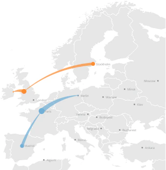
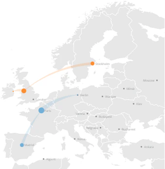
Routes > Straight Routes | When checked, route lines appear straight instead of curved (which is the default). In the first example at right, route lines appear curved; in the second example they appear straight. |
|
Routes > Symbol Transparency | Determines the transparency for connection lines. You can select any value from “none” (totally opaque) to 80% (almost transparent). The default is “none.” In the first example at right, the transparency has been set to “none”; in the second example, it has been set to 80%. |
|
Scale > Use Log Scale | Allows you to convert your map scale to a logarithmic scale. | — |
Background > Color | Lets you choose the lightness of the background. The default is Very Light . The example shows a map in which the background lightness has been set to Medium . | 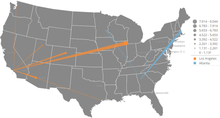 |

Aggregating rows
You can aggregate like rows in a latitude-longitude route map, and the map points reflect the aggregated values. In the following example, the user uploads a DataSet with two rows for “Berlin-Paris.”
